Rebranding
General Electric has used their current logo since 2004. But even before that, their logo has stayed almost exactly the same since it was developed in 1892. We attempted to design a new logo that remained true to General Electric's root identity, but stepped out in a bold manner to convey their mission to "build a world that works."


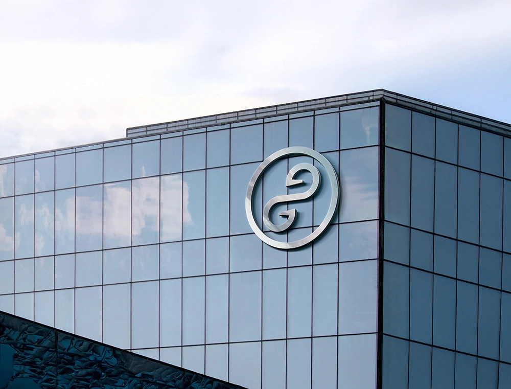
Globe
To retain familiarity with the old branding, but also represent GE's mission to power the world.

Infinity Symbol
Representing GE's as the provider of limitless global energy.

G
The first letter of the first name 'General.'

E
The first letter of the second name 'Electric,' flipped around.